Pure mathematicians might like you to think that they're just that much smarter. But frankly, I've never had to visualize anything high-dimensional in my pure math classes. Working things out algebraically is much nicer, and using a lower-dimensional object as an example or source of intuition usually works out -- at least at the undergrad level.
But that's not a really satisfying answer, for two reasons. One is that it is possible to visualize high-dimensional objects, and people have developed many ways of doing so. Dimension Math has on its website a neat series of videos for visualizing high-dimensional geometric objects using stereographic projection. The other reason is that while pure mathematicians do not have a need for visualizing high-dimensions, statisticians do. Methods of visualizing high dimensional data can give useful insights when analyzing data.
"But there aren't any more direction to draw the fourth axis..."
A professor would draw the usual x, y and z-axis on the 2D chalkboard, then announce that there aren't any more directions remaining to draw another axis until someone invents a 3D chalkboard. Then I would die a little.
Of course there is! How did we pick the direction to draw the z-axis on a 2D surface? We picked a direction not parallel to the x and y-axis, kind of at random (because any such direction would work). In doing so, we decided on a projection of the 3D space onto the 2D surface, like this:

There are some ambiguities as to which points in the 3D space these black points actually represent. In fact, each point above has an entire line projecting to it. Sometimes, authors would disambiguate points by dropping a line parallel to the z-axis down to the x-y plane, like this.


So voila, we get a projection of 4D space onto the 2D surface of your screen. The following image from Wikipedia showing hypercubes of dimensions 1-4 uses the same method as above:
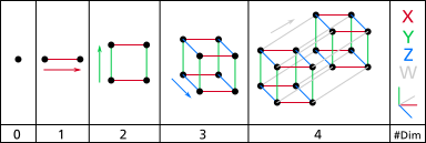
Technically speaking, this method can work for any number of dimensions, but things gets messy and confusing very quickly. Even in the 4D plot above it's challenging to wrap your head around what's happening -- dropping verticals parallel to all the other axes might help a bit, but even in 5D this would get pretty messy. Perhaps that's why the images of the hypercube stopped at dimension 4.
So, are there nicer ways of visualizing even higher dimensional data?
Yes, there are many, and they are often used in statistics. One simple technique is to map certain dimensions to other features of each "point" -- its shape, colour, size, etc. This is so often done that you probably wouldn't even think of it as a visualization technique, but it works for visualizing a few more dimensions. There are other techniques, too:
Radial plots have all the axes in a circle, like below, with each "point" or observation drawn as a polygon with vertices determined by its value along each axes. Sometimes it is better to make separate plots for each "point", since overlapping lines can make the chart messy. Again this works well for visualizing a handful of dimensions, and small number of "points" or observations.
Parallel coordinate plots are like unwrappings of the above. A "point" becomes a series of line segments connecting its values along each dimension. This chart is considerably less messy, so a larger number of "points" can be plotted on a singe graph.

Then there are goofier things like Chernoff's faces, which maps dimensions to features of faces. The idea is that since we are biologically hardwired to tell apart faces, we'd be able to easily tell which data points are similar to each other and which ones are different.
All of these plots make it relatively easy to find clusters within the data. However, it is difficult to find geometric properties: Can you imagine what points on a tetrahedron in 3D would look like here? A sphere? Thus from a mathematical standpoint, these graphics do not preserve anything that is usually of geometrical importance (angels, lengths, etc) -- stereographic projection fare better, but algebraic techniques are often quite powerful.
Visualizing High Dimensional Data is a Statistician's Problem, not a Mathematician's
To conclude, it is possible to visualize high dimensional objects. However, from the point of view of a pure mathematician, such visualizations are usually less helpful compared to algebraic techniques and intuitions on how low-dimensional object behave. Thus the problem of visualizing high-dimensions is a statistician's problem. Statisticians have much more to gain from visualizing their high-dimensional data.
So if you ever want to ask this question to a pure mathematician, ask a statistician instead. They'll be able to give you a better answer.
[PS: As @chlalanne pointed out, statisticians have built pretty good tools for visualizing high dimensional data. GGobi is a pretty powerful one. It interfaces with R through the rggobi package.]
End of Entry